| Most of the examples used in these notes refer to the Clock Reaction Lab (Module 2: Chemical Kinetics)
- Create a new file for your set of data. You can use the same file to enter data for different parts of an experiment.
- It is useful to include titles and column headings for your data.
|

|

|
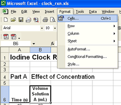
- Column headings should be typed in a single cell. If they are too long, you can get the text to fit by wrapping the text. To do this, select the cell with the mouse, then select “Format” and “Cells”:
|
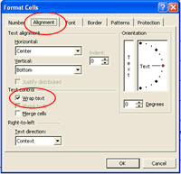
- In the Format – Cells dialogue box, select the “Alignment” tab and check “Wrap Text”.
|

|
|
- When typing in your data, be sure not to include any blank rows or columns in the data table. This includes rows beneath the column headings.
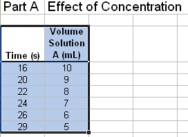
- To create a graph, highlight the data to be graphed, including row headings.
|
- Select the Chart Wizard tool:

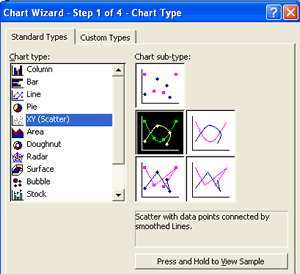
- For the chart type, select the XY (Scatter) type of graph (your selection here may differ, depending on what type of graph you need. You’ll often find, however, that the XY (Scatter) graph is better than the Line type for your data.)
|
|
|
- Click the “Next” button to move to Step 2, then continue to Step 3.
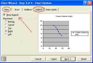
- At Step 3 of the Wizard there are several options to change:
- Select the “Legend” tab and uncheck “Show Legend”
- Select the “Title” tab to add titles to the chart. Be sure to include units for the X and Y axes.
|
 |
|
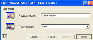
- For the final step of the Wizard I recommend placing the chart as a new sheet, and giving the sheet an appropriate name. This places the graph on it’s own Excel worksheet (which is still part of the same file where the data is stored). Placing the graph on it’s own sheet results in a nice, full page graph when printed.
|
|
| |
|


|
Once the graph has been created there are several things that can be done to improve the appearance of the graph:
|
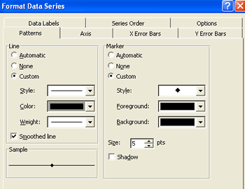
- To change the color and/or style of the plotted line, and the style of marker used, double-click the line to access the following dialog box:
- If using a black-and-white printer, set the line and marker colors (both foreground and background) to black. You may want to check the Smoothed line option. You can also change the size of the maker
|
|
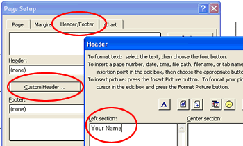
- A custom header is created by selecting “Page Setup” from the “File” menu.

|
Some Advanced Tips
|
1. Changing the minimum values on the X and Y axis.
Depending on your data, Excel normally creates a graph extending to the value zero for both the X and Y axis. This may not always be desired.
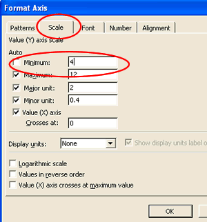
To change the default value of the minimum values for each of the axes, click ONCE on either the X or Y axis to select it (this may take some practice), then right-click and select format axis from the pop-up menu. Change the minimum value to the desired value.
There are a number of other options you can change for the axis if desired.
|
|
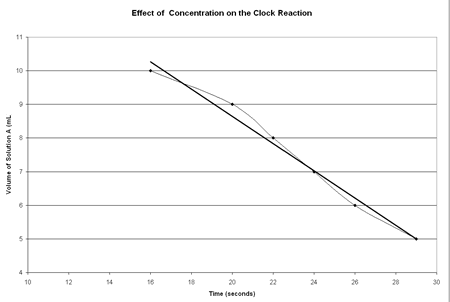
2. Creating a line of best fit
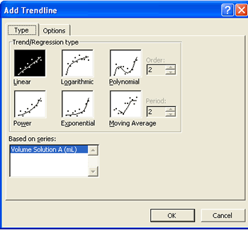
A statistical “line of best fit” can be easily created for your data. From the “Chart” menu select “Add Trendline” and select the “Linear” option.
Be careful using this option! You don't want to force a normally curved line (such as you would find for rates of reaction) into a straight line.
|
 |
| |
|
A Line of Best Fit

|
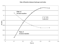 Graphing is an important skill to learn in the science classroom. Students should be encouraged to use spreadsheet programs to create graphs. These notes provide some useful hints and tips for creating graphs using Microsoft Excel 2002. Other spreadsheets may also be used.
